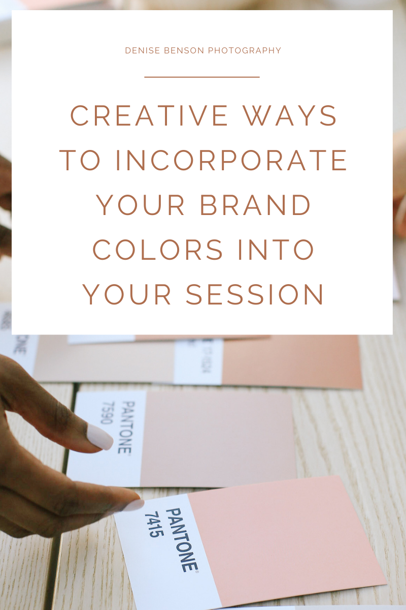
Color Your Brand: Unveiling 3 Creative Ways to Showcase Your Brand Colors in Your Photoshoot
Color isn’t just a visual element; it’s a language that speaks volumes about your brand. When strategically used, brand colors can infuse life, personality, and a distinctive identity into your visuals. In this blog post, we’ll explore three innovative ways to leverage your brand colors in your upcoming branding photoshoot.
Monochromatic Magic: Elevating Elegance with a Dominant Hue:
Monochromatic schemes involve using different shades and tones of a single color. This approach creates a visually harmonious and sophisticated look that allows your brand color to take center stage. Here’s how you can implement this technique:
- Wardrobe and Props: Encourage your team or models to wear clothing in varying shades of your primary brand color. Integrate accessories and props that complement these tones.
- Background and Set Design: Choose locations or set elements that align with your monochromatic theme. This could involve finding spaces with walls, furniture, or natural elements that naturally boast your brand color.
Contrast and Complement: Creating Dynamic Visual Stories:
Contrasting and complementing colors can inject energy and vibrancy into your brand visuals. This approach involves pairing your primary brand color with its complementary or contrasting color on the color wheel. Here’s how to make it work:
- Two-Color Wardrobe Palette: Encourage diversity in wardrobe choices by introducing your primary brand color alongside its complementary color. This adds visual interest and dynamics to the composition.
- Strategic Color Blocking: Plan shots that showcase strategic color blocking, where the contrasting or complementary colors are intentionally placed in the frame to create a striking visual impact.
- Product Integration: If applicable, feature your products strategically in the contrasting or complementary color. This draws attention to your offerings while seamlessly integrating them into the overall color scheme.
Color Pops in a Neutral Landscape: Adding Accents for Emphasis:
For a subtler yet impactful approach, consider using your brand color as a focal point within a neutral or muted color palette. This allows your brand color to pop and become a visual focal point. Here’s how to achieve this effect:
- Neutral Backgrounds: Choose neutral backgrounds or settings that provide a clean canvas for your brand color to stand out. This could be a white studio backdrop, a neutral-toned room, or an outdoor setting with soft hues.
- Accent Accessories and Details: Utilize accessories, props, or elements within the frame in your brand color. This could include a vibrant scarf, a carefully placed object, or a splash of color in the environment.
Your brand colors are more than just a visual choice; they’re a storytelling tool. By strategically incorporating these colors into your branding photoshoot, you can create a visual narrative that resonates with your audience, reinforces your brand identity, and sets you apart in a sea of visuals.


